Hey, I’m Bella.
I am a junior Advertising & Digital Marketing student at the University of Oklahoma. I love all things copywriting and brand strategy.
My favorite pieces are below for you to enjoy!
My Copywriting Work.
My Copywriting Work.
ADDY AWARD WINNER
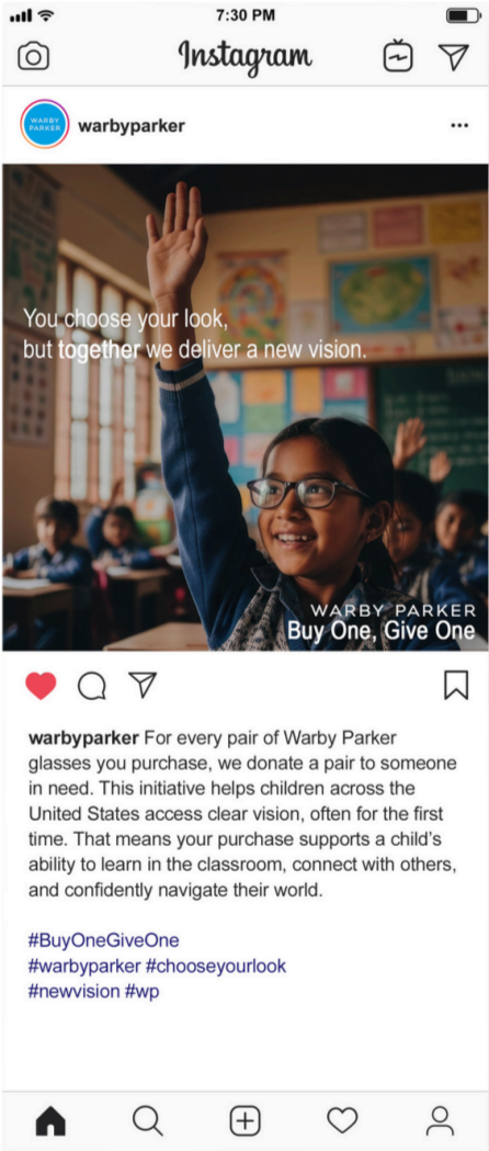
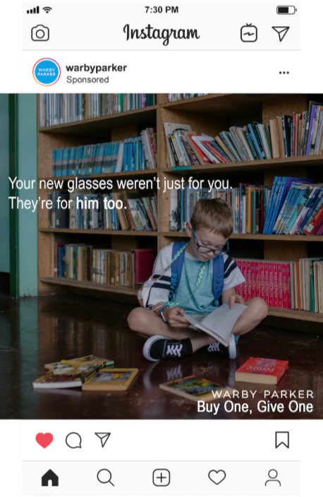
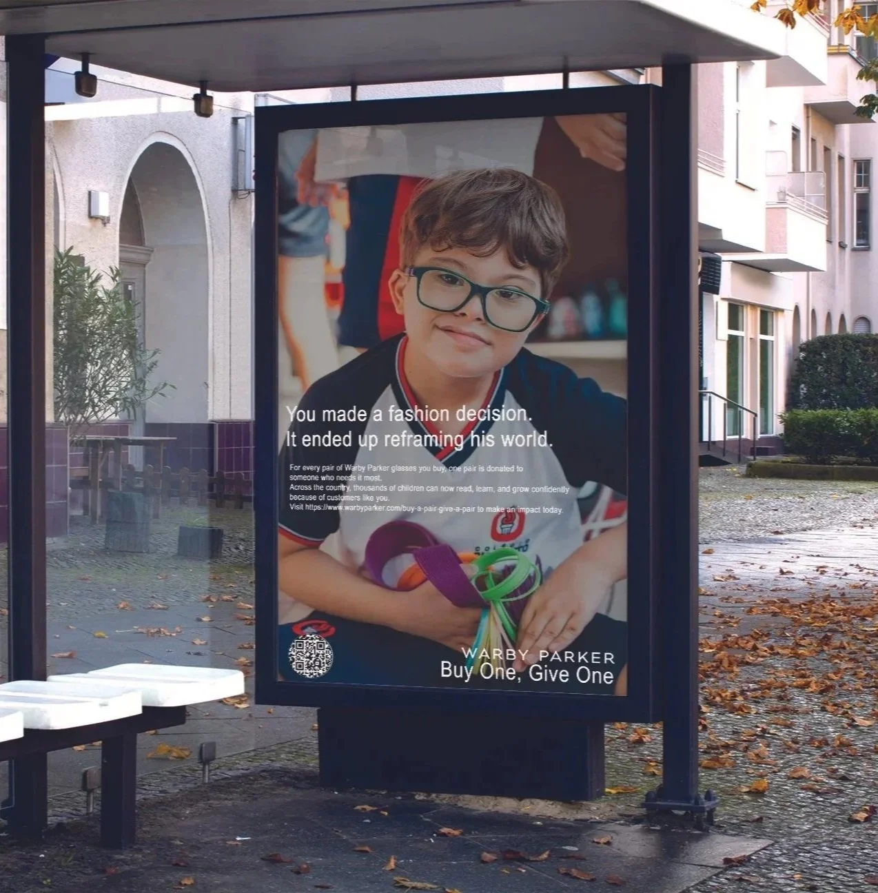
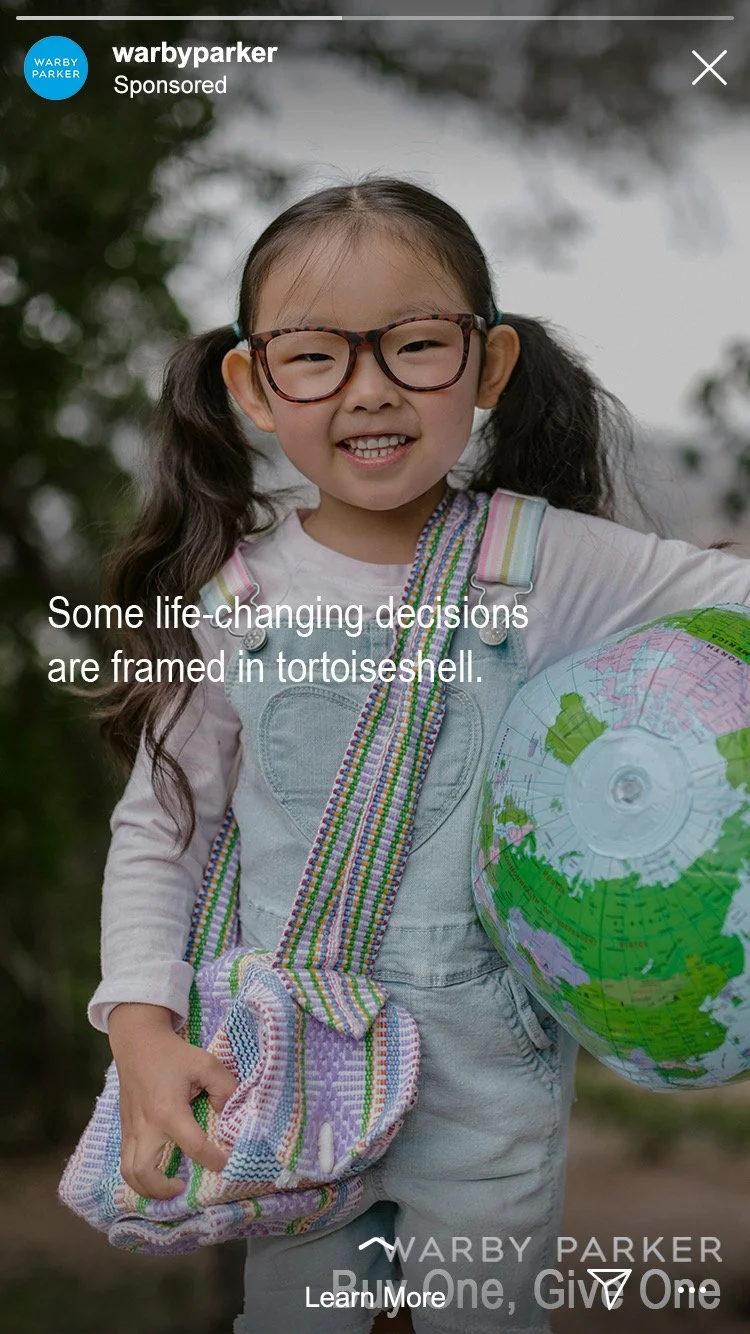
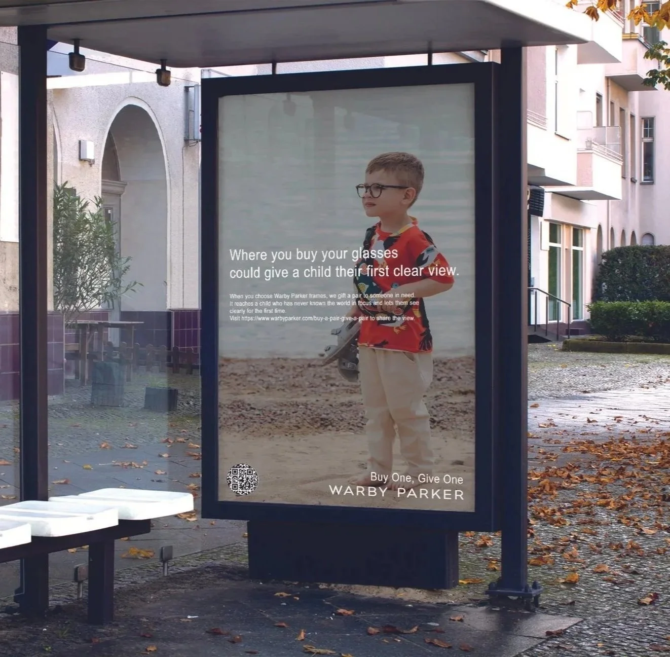
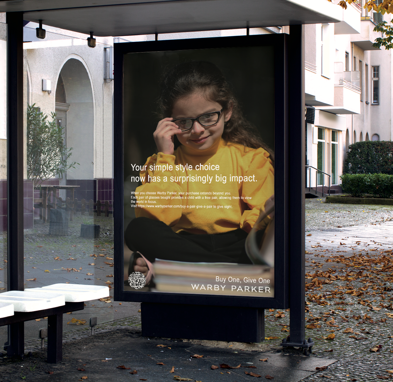
Clear vision can change everything: a child’s confidence, learning, and sense of belonging. Built around Warby Parker’s Buy One, Give One program, this campaign shows that simply picking a pair of glasses for yourself helps a child see the world clearly. For every pair sold, Warby Parker distributes a pair to someone who otherwise might not have access to glasses, helping more people see the world clearly.
Social posts and stories capture everyday classroom moments and emotional milestones, using relatable language and emotion to engage audiences. Bus shelter ads reach parents and caregivers in their daily routines, giving them a moment to pause, reflect, and connect with the message. These spaces encourage storytelling that feels personal and meaningful.
Warby Parker - “Buy one, Give one.”
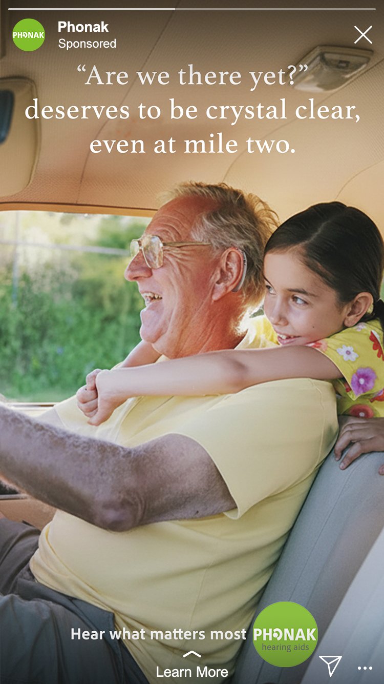
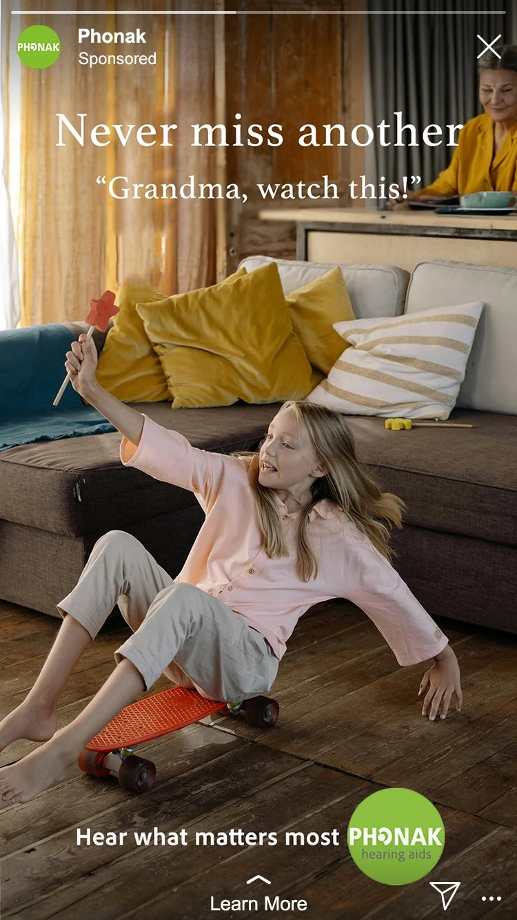
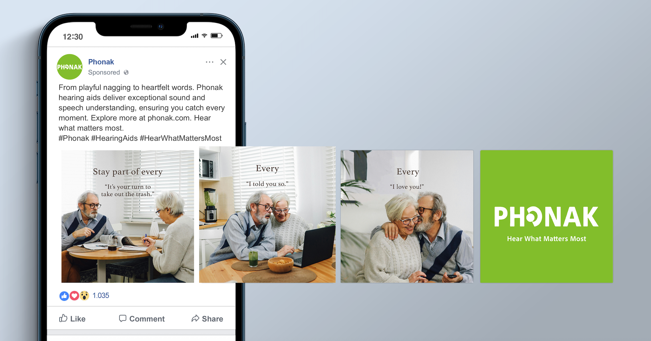
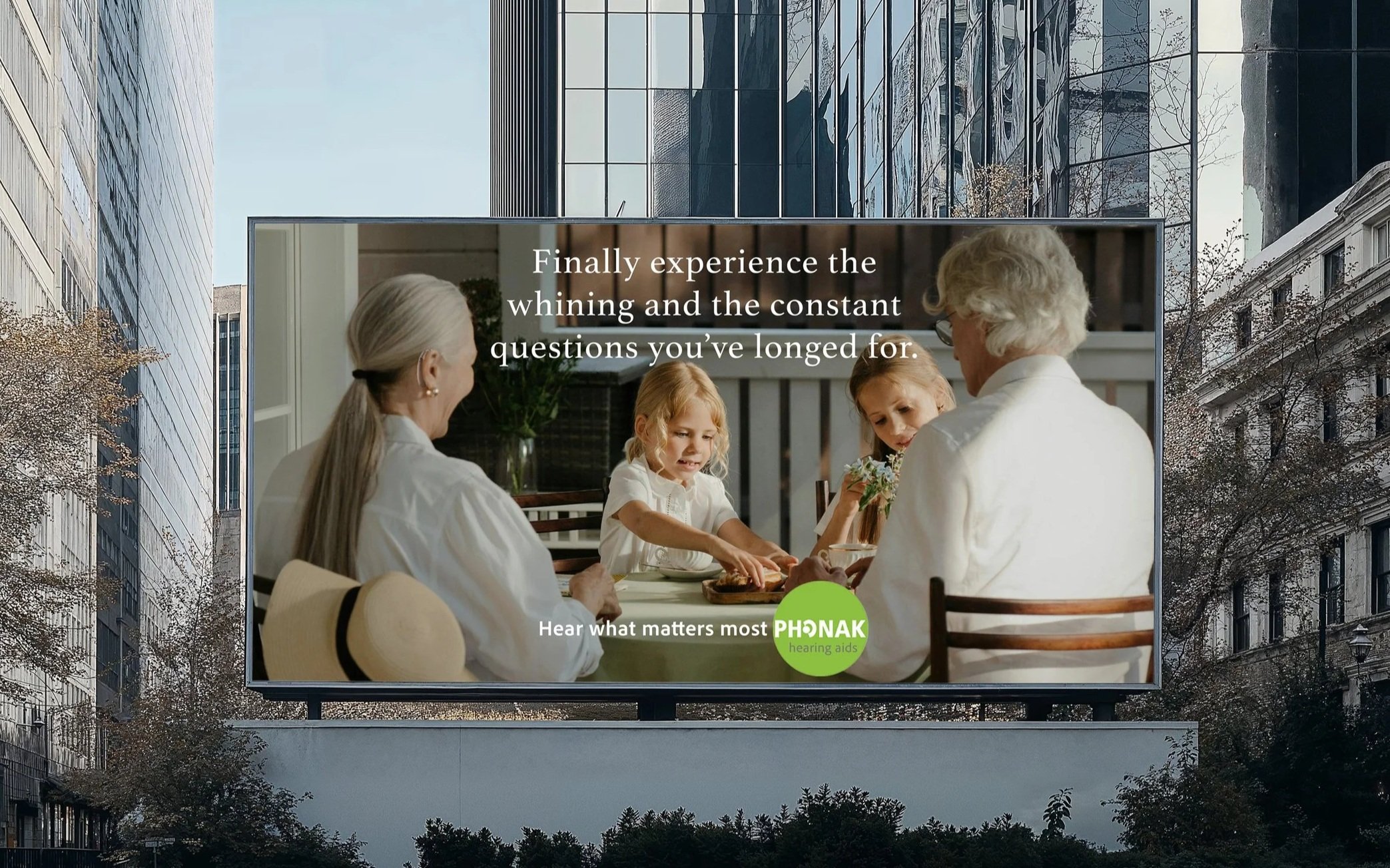
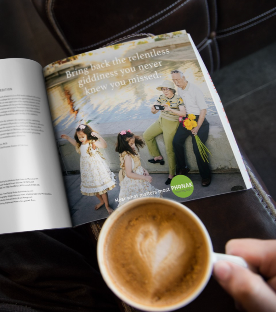
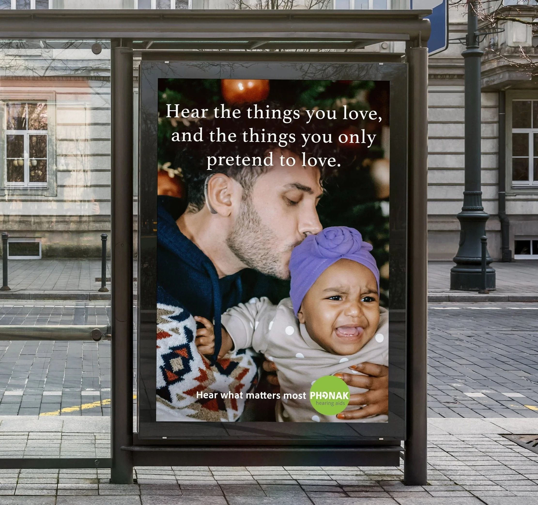
Phonak Hearing Aids - “Hear what matters most.”
Life doesn’t get quieter, and neither should you. This Phonak Hearing Aids campaign targets families and older adults, conveying hearing loss not as silence, but as missed connections. The ads capture everyday moments that make life complete, like hearing the same family story for the hundredth time, kids arguing in the back seat, or catching a quiet “I love you.”
Across three print and three social executions, headlines mix emotion, relatability, and a touch of humor to remind audiences that even the slightly annoying sounds of family are worth holding on to.
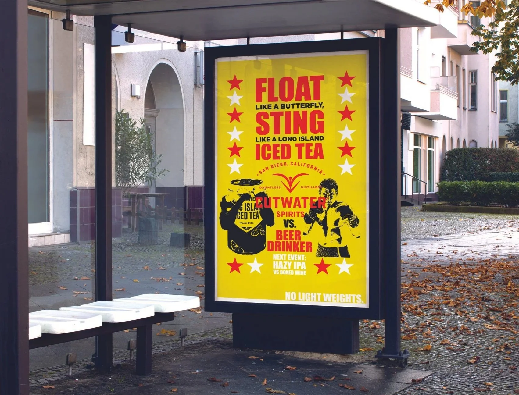
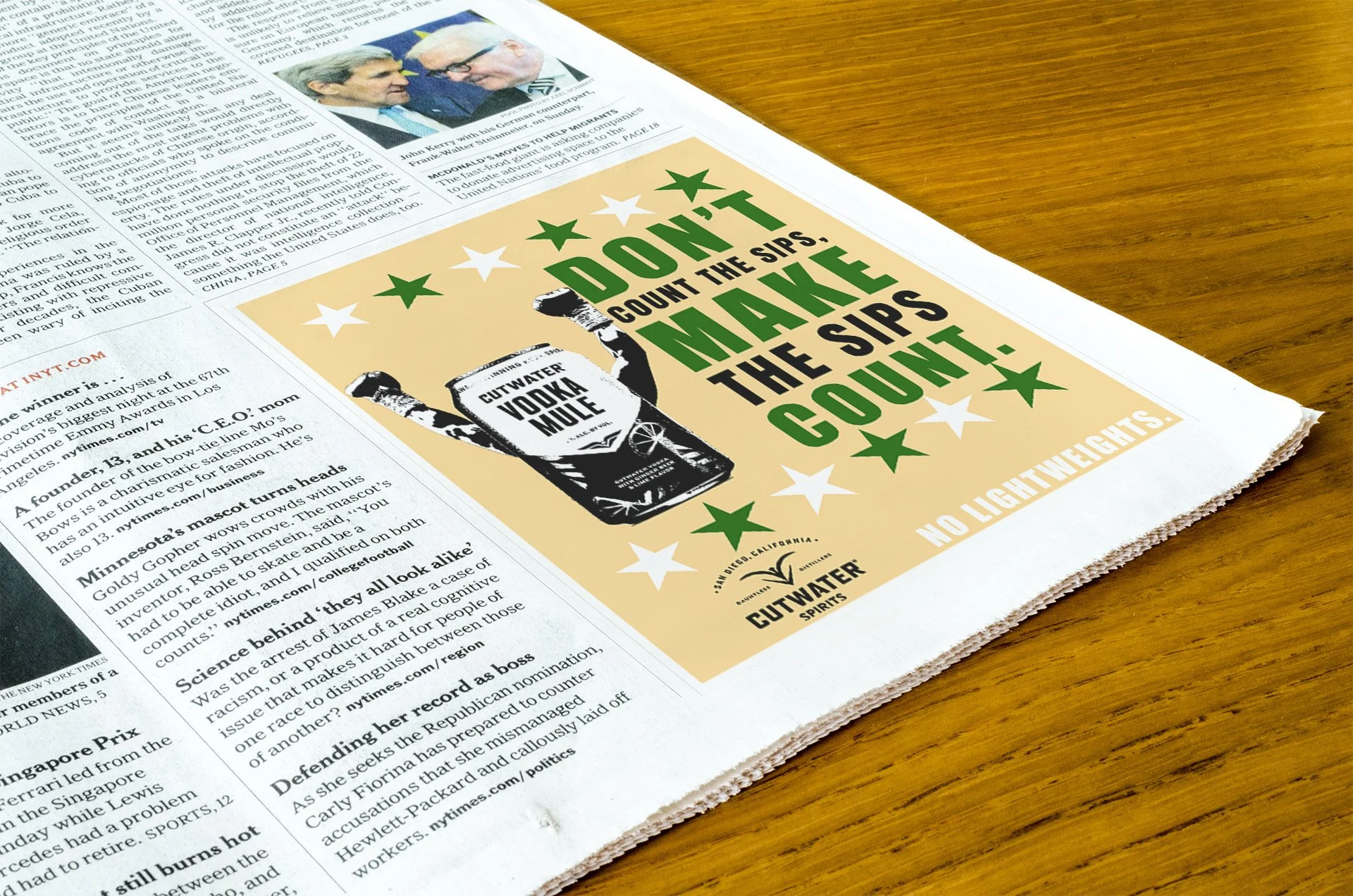
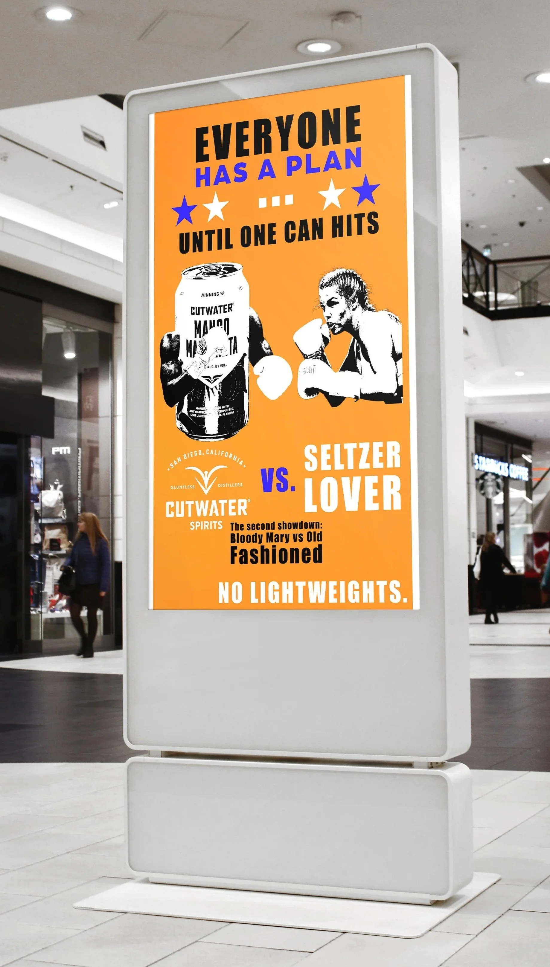
Cutwater - “No Lightweights”
This Cutwater campaign plays off iconic boxing quotes to reinforce the brand’s bold, high-ABV positioning. Borrowing language from legendary fighters signals strength, confidence, and toughness, qualities that mirror Cutwater’s canned cocktails. The tagline, “No lightweights.” nods to boxing weight classes while making a clear statement about the strength of the drink itself.
The campaign positions Cutwater as a drink for those who can handle it. Confident, punchy, and unapologetic, the boxing-inspired copy shows that these cocktails pack real power and are meant for drinkers who are anything but lightweights.
Ad A Day
Challenge.
For 30 days straight, I created and shared one ad per day on social media. The challenge pushed me to think quickly, trust my instincts, and create strong ideas on a tight turnaround. It sharpened my creative problem-solving skills and proved that speed doesn’t have to kill a good concept.
Below are a few of my favorite pieces from the challenge.
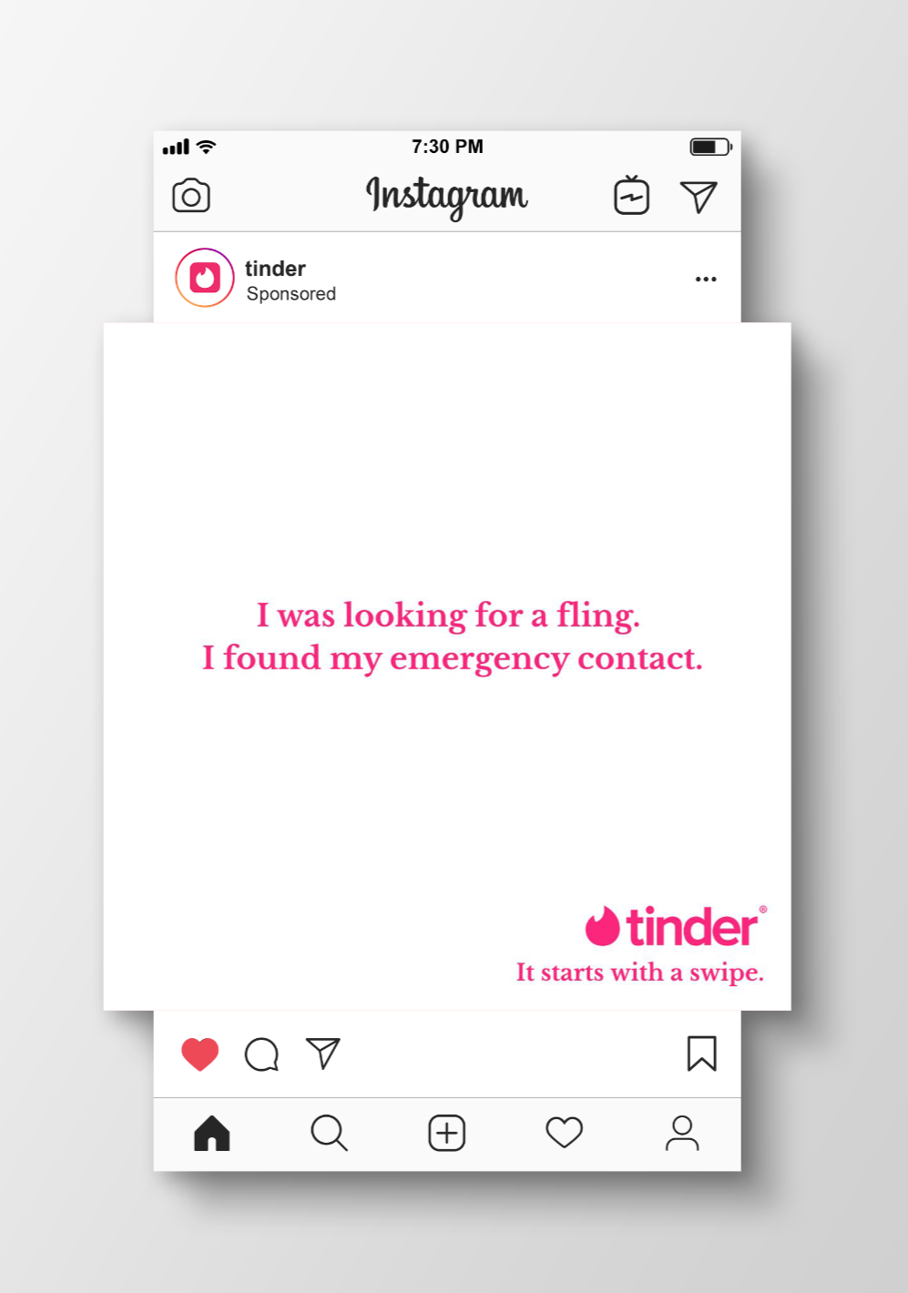
Tinder - ADDY Award Winner
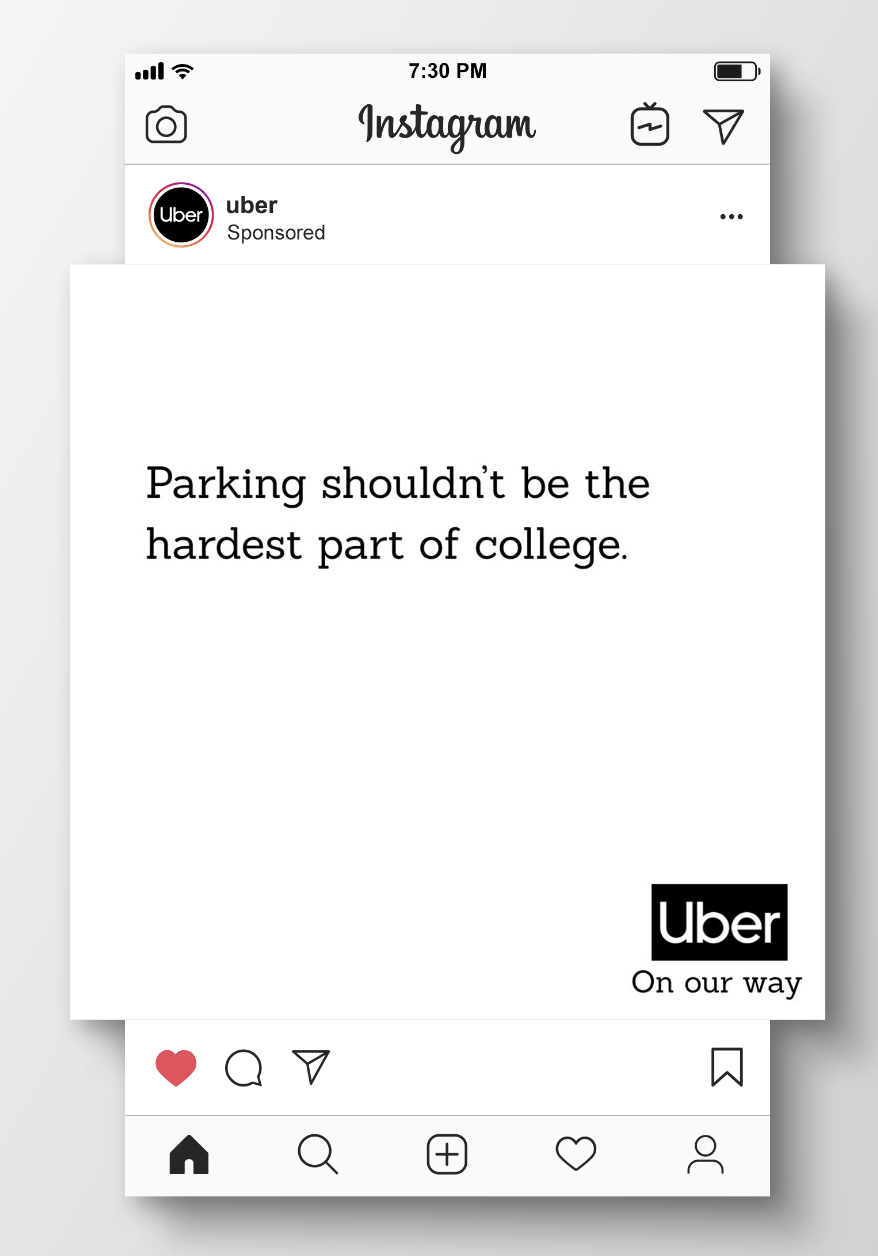
Uber - ADDY Award Winner
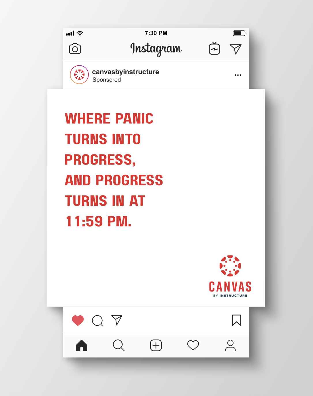
Canvas - ADDY Award Winner
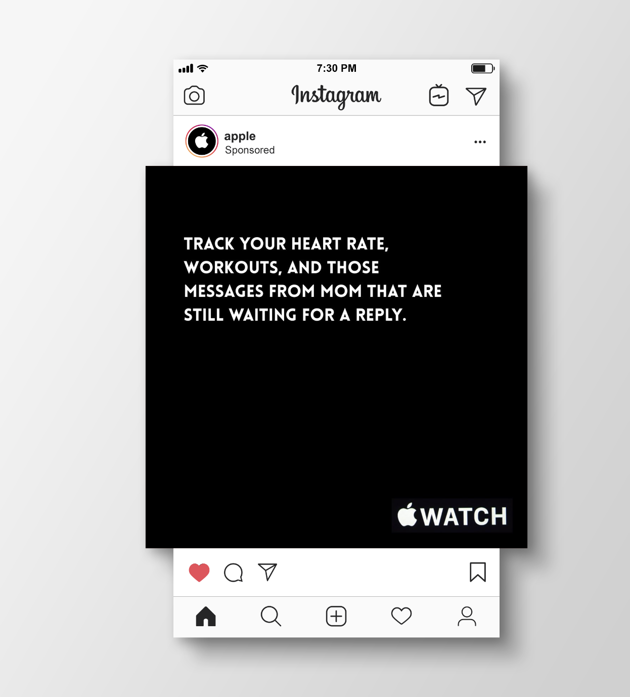
Apple Watch
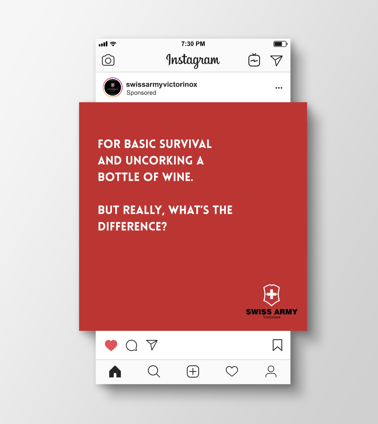
Swiss Army Knife
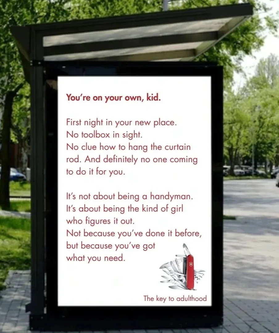
Swiss Army Knife - Long Copy
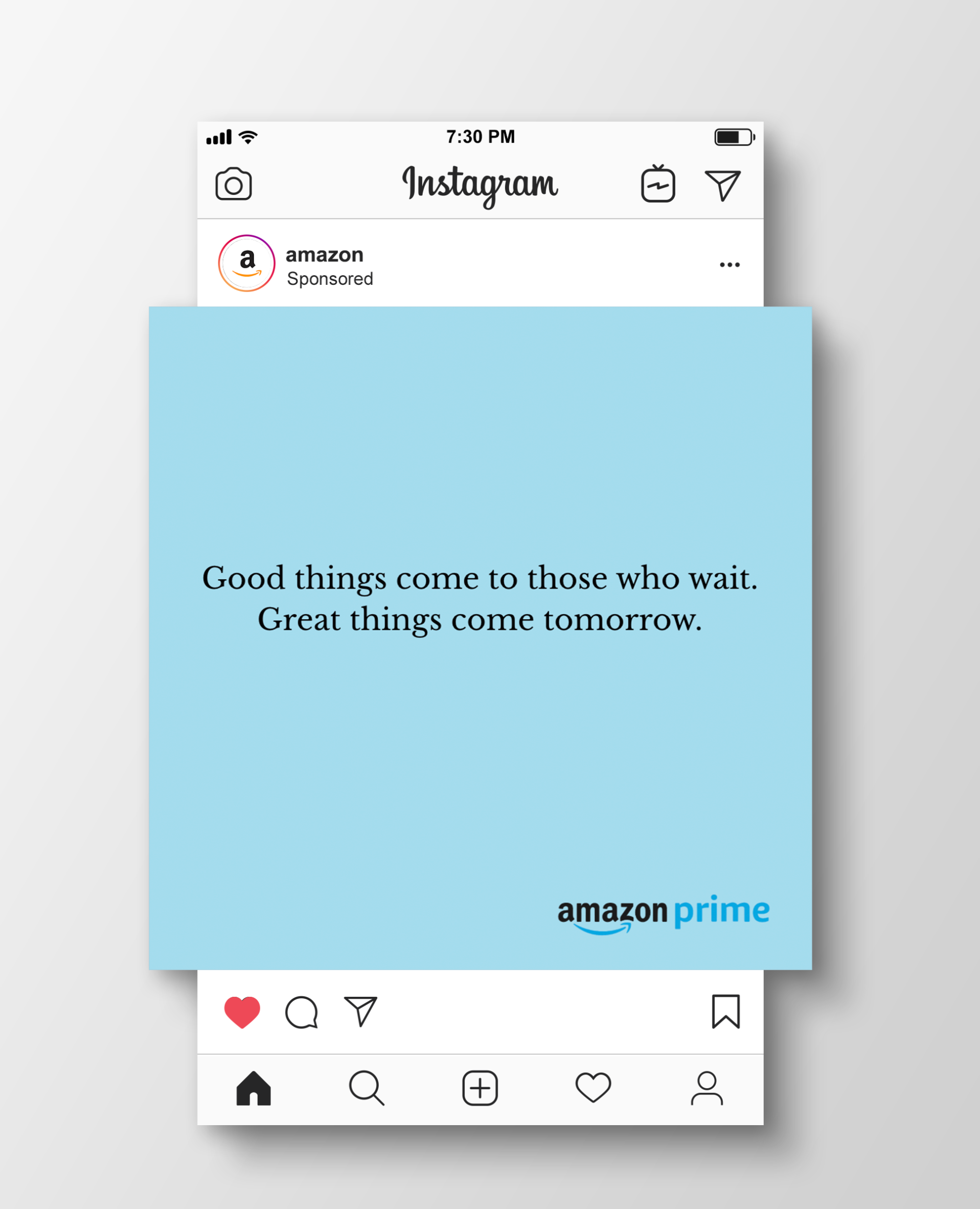
Amazon Prime
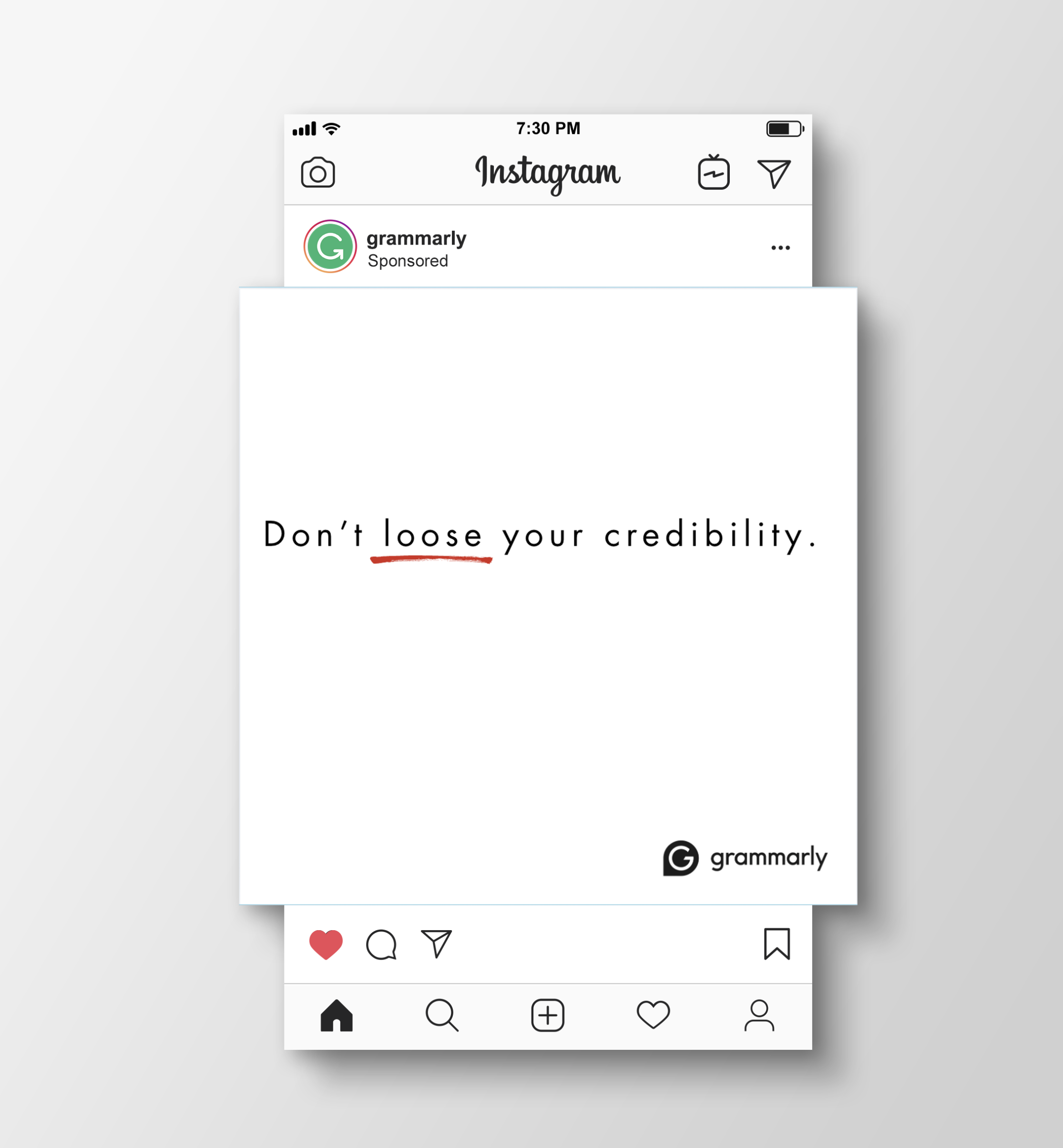
Grammarly
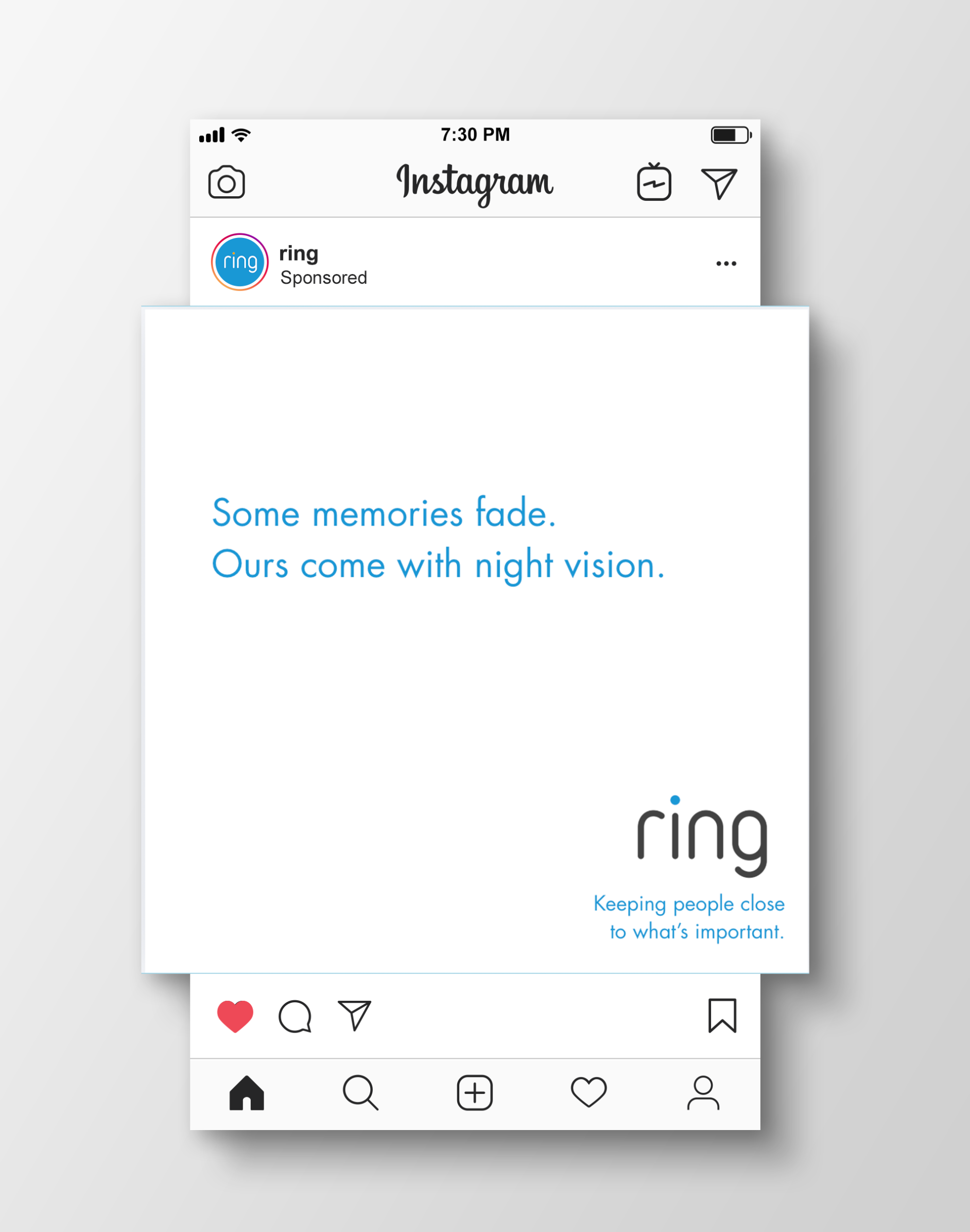
Ring
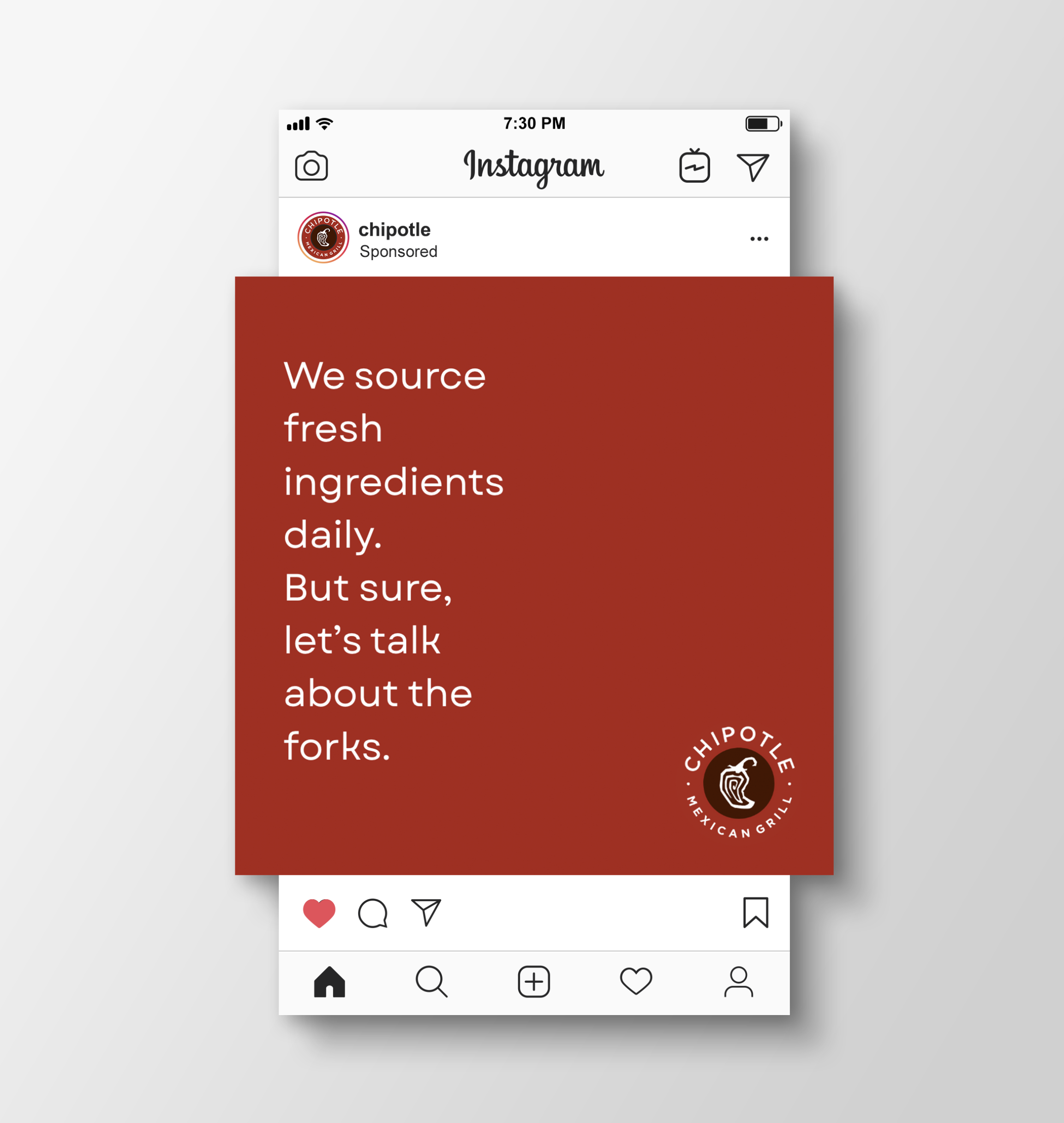
Chipotle
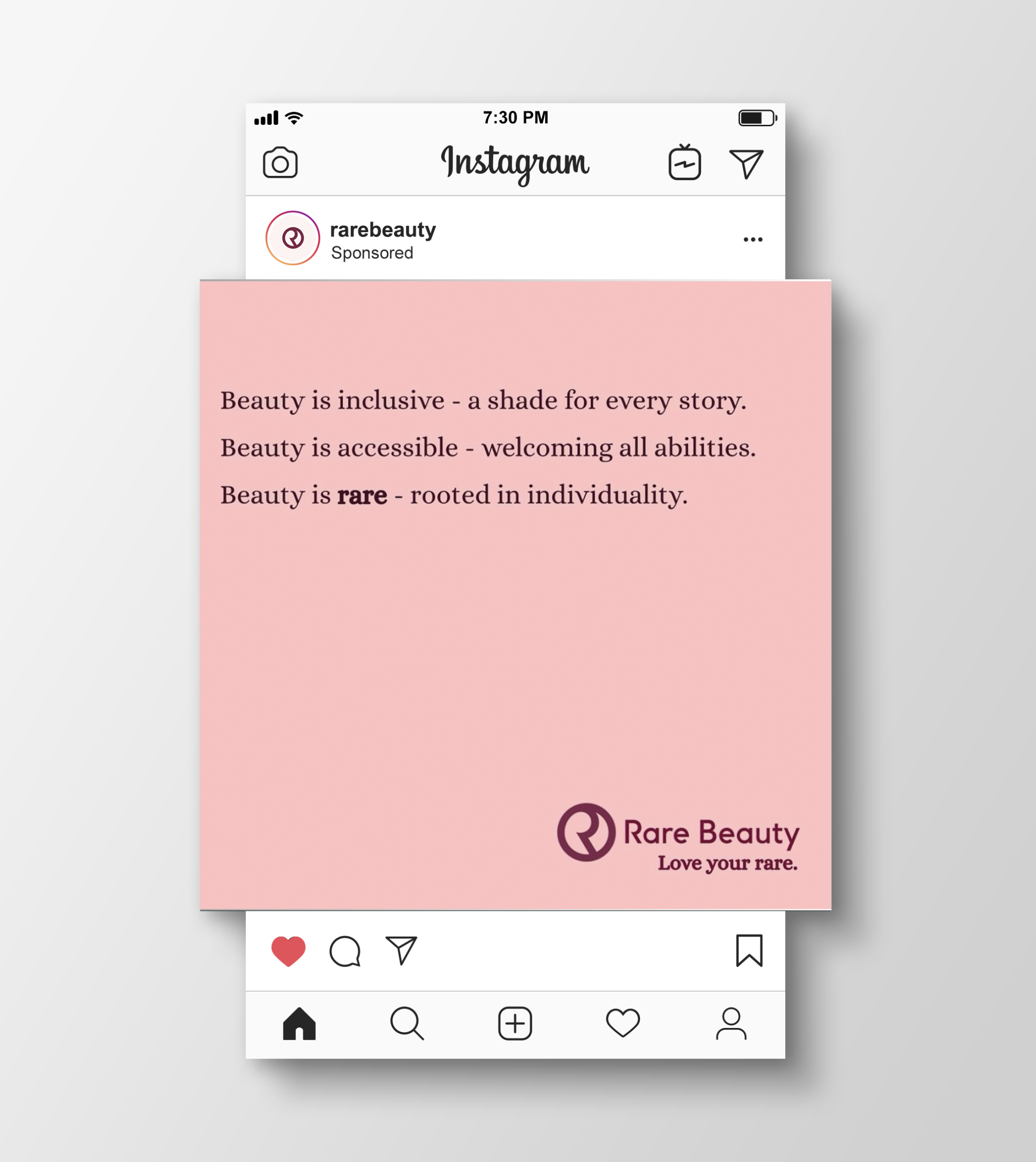
Rare Beauty
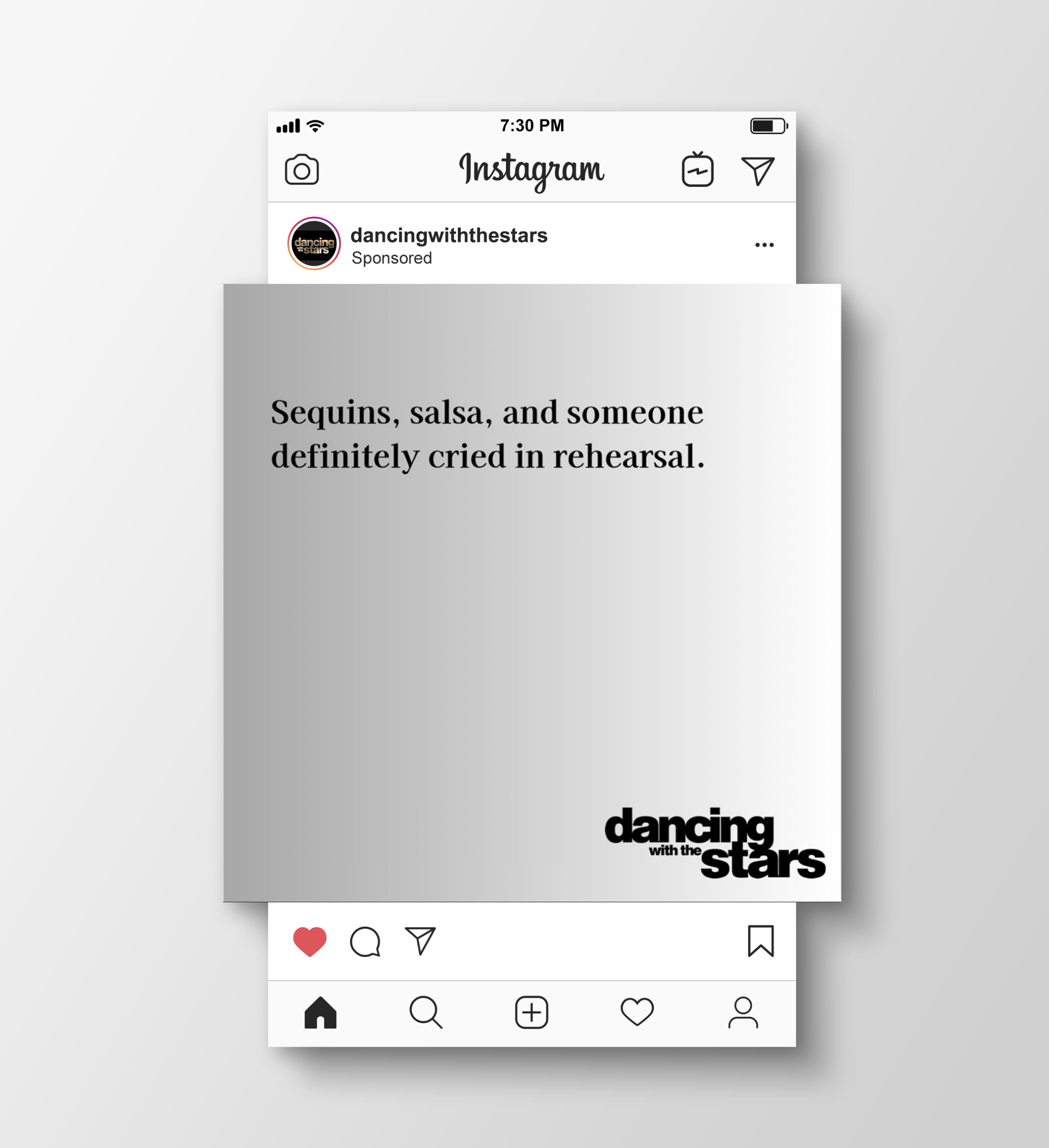
Dancing with the Stars
My Design Work.
My Design Work.
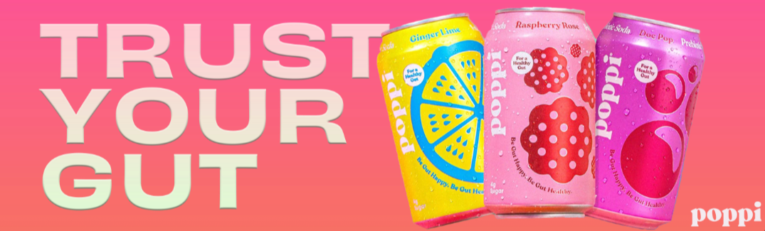
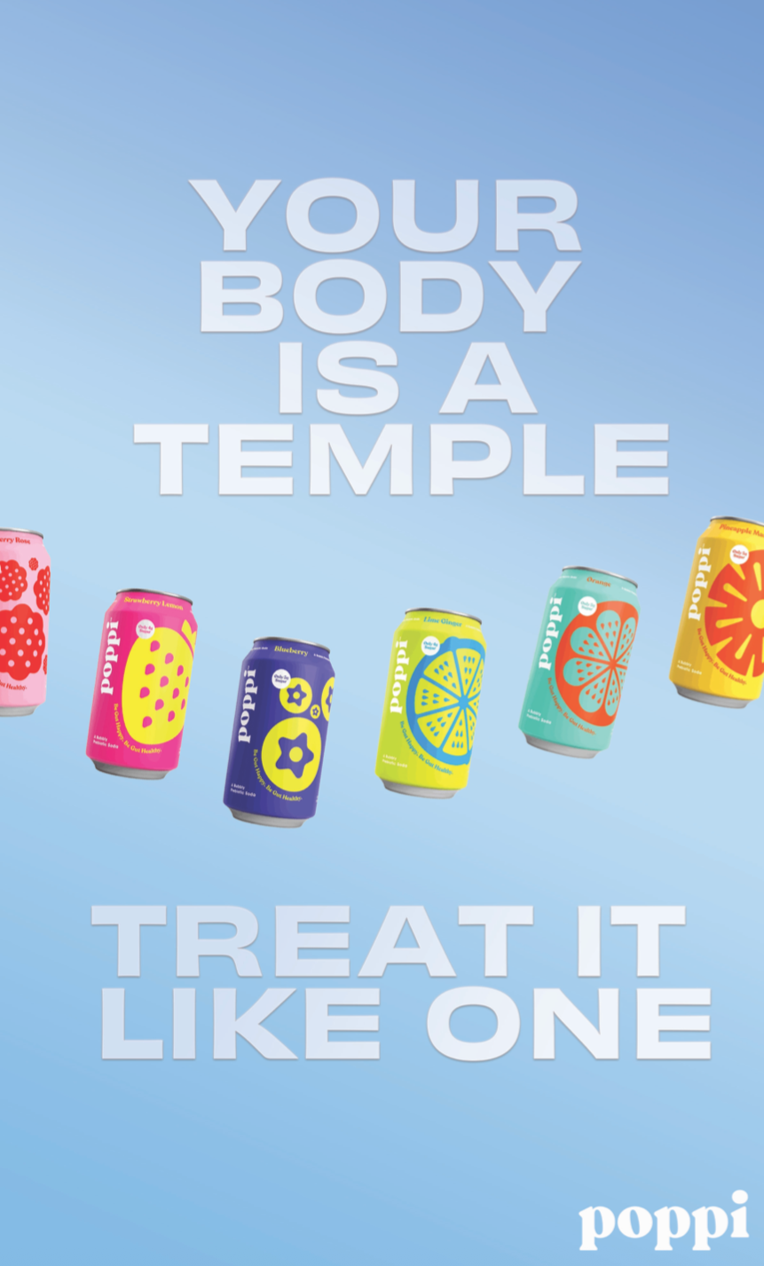
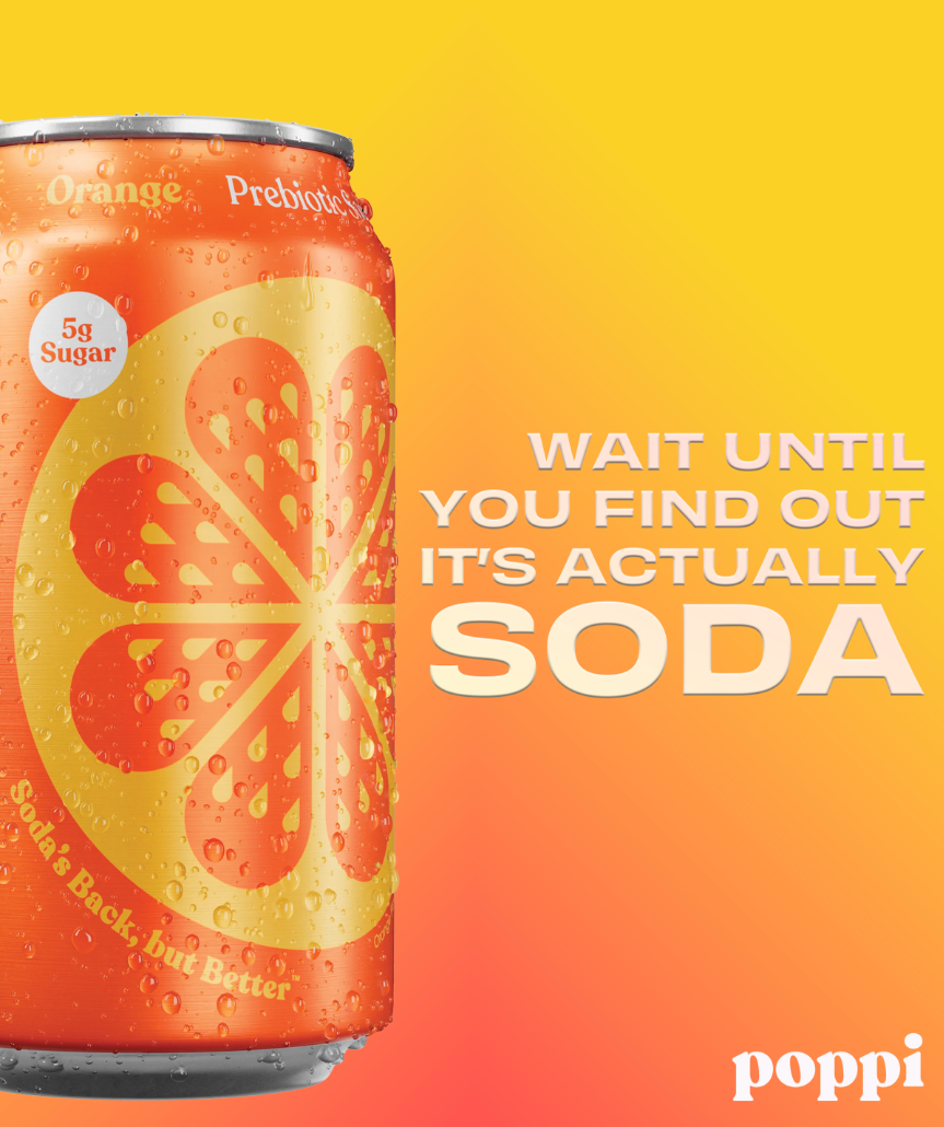
Poppi
Poppi’s cans and current advertising are bold, bright, and full of color, which made the design process especially fun. I enjoyed experimenting with layered gradients and writing headlines that fit the brand’s energetic tone.
For this series, I used vibrant gradient backgrounds and applied a subtle gradient effect to the typography as well. The concepts explore a mix of dominant visuals and dominant headlines across different formats, including a billboard, newspaper ad, and bus poster.
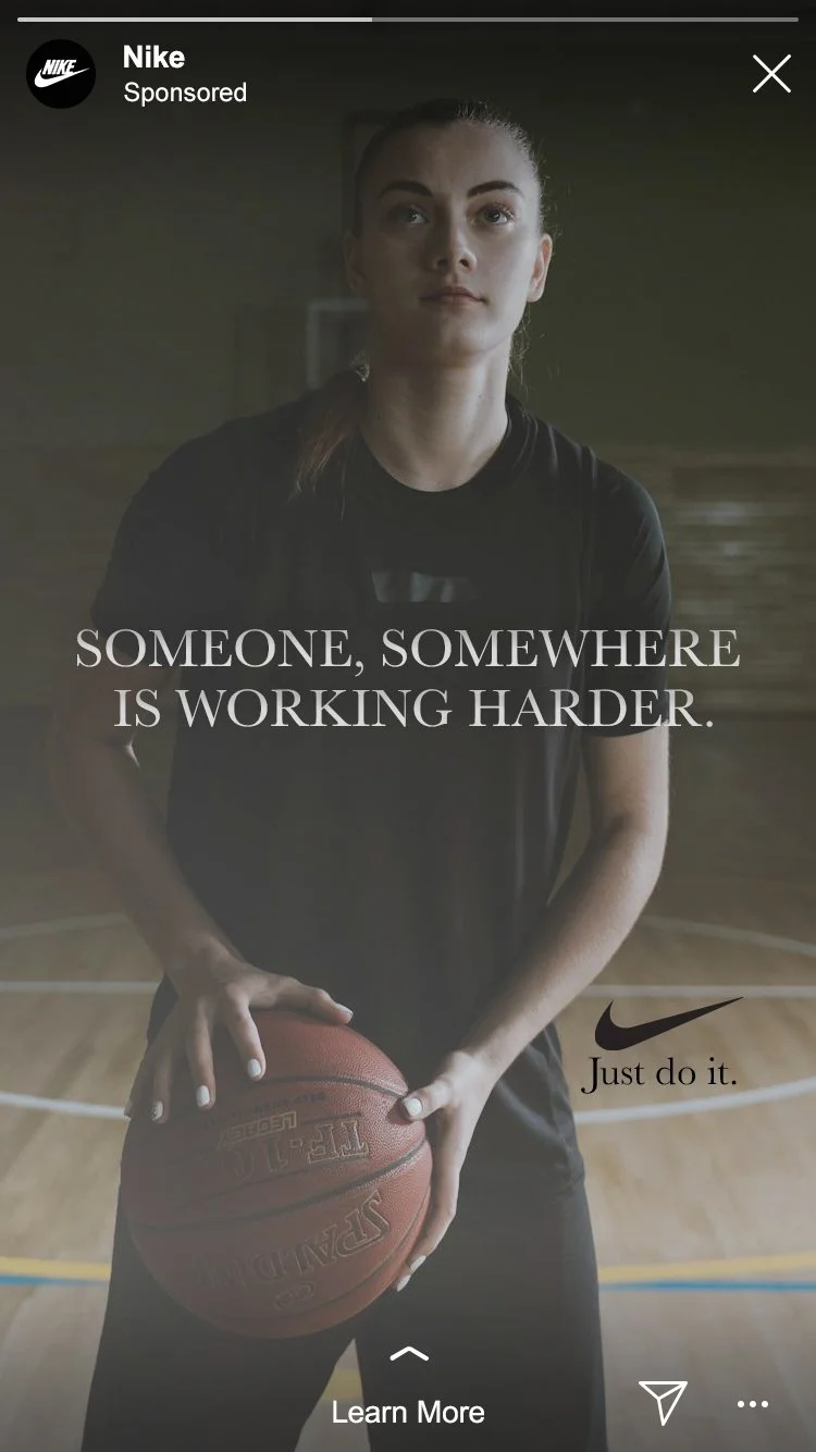
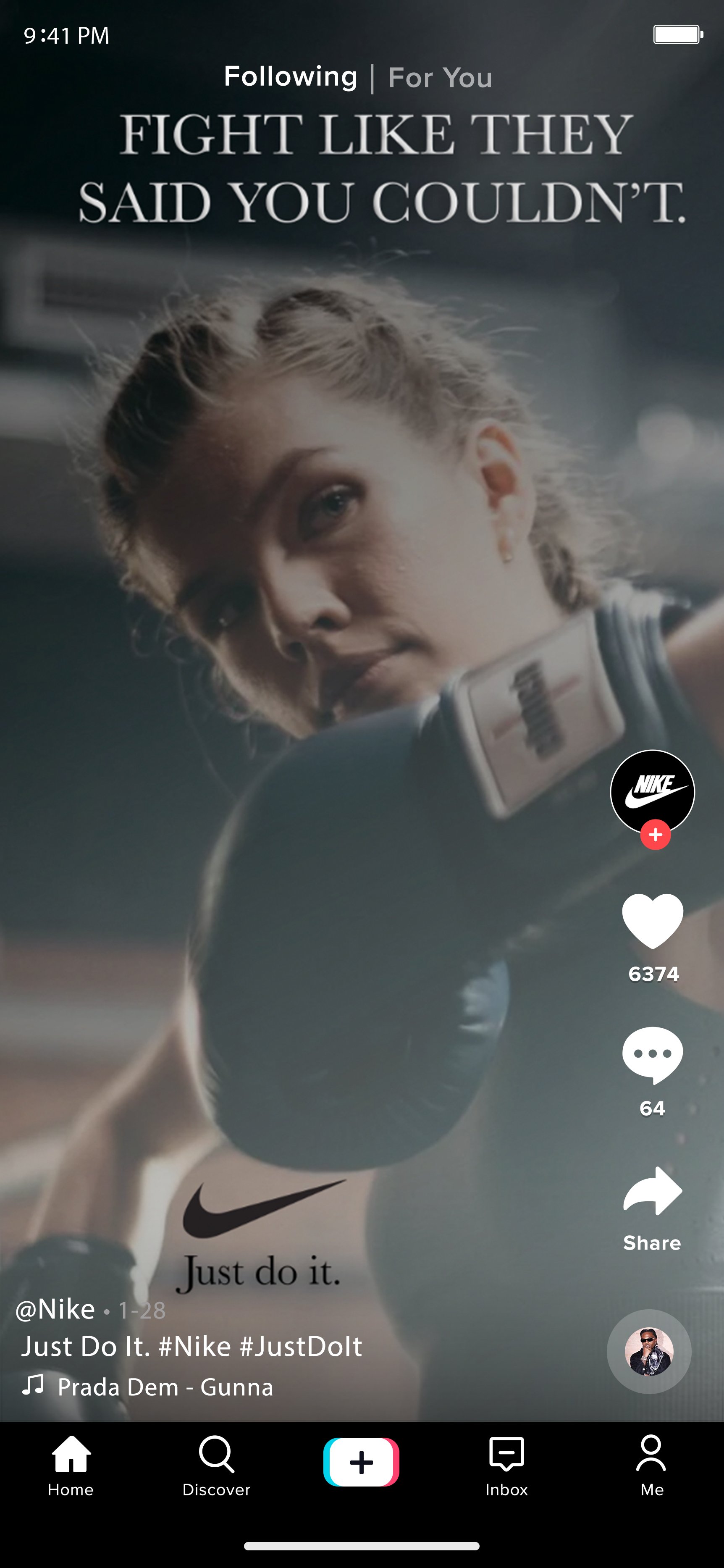
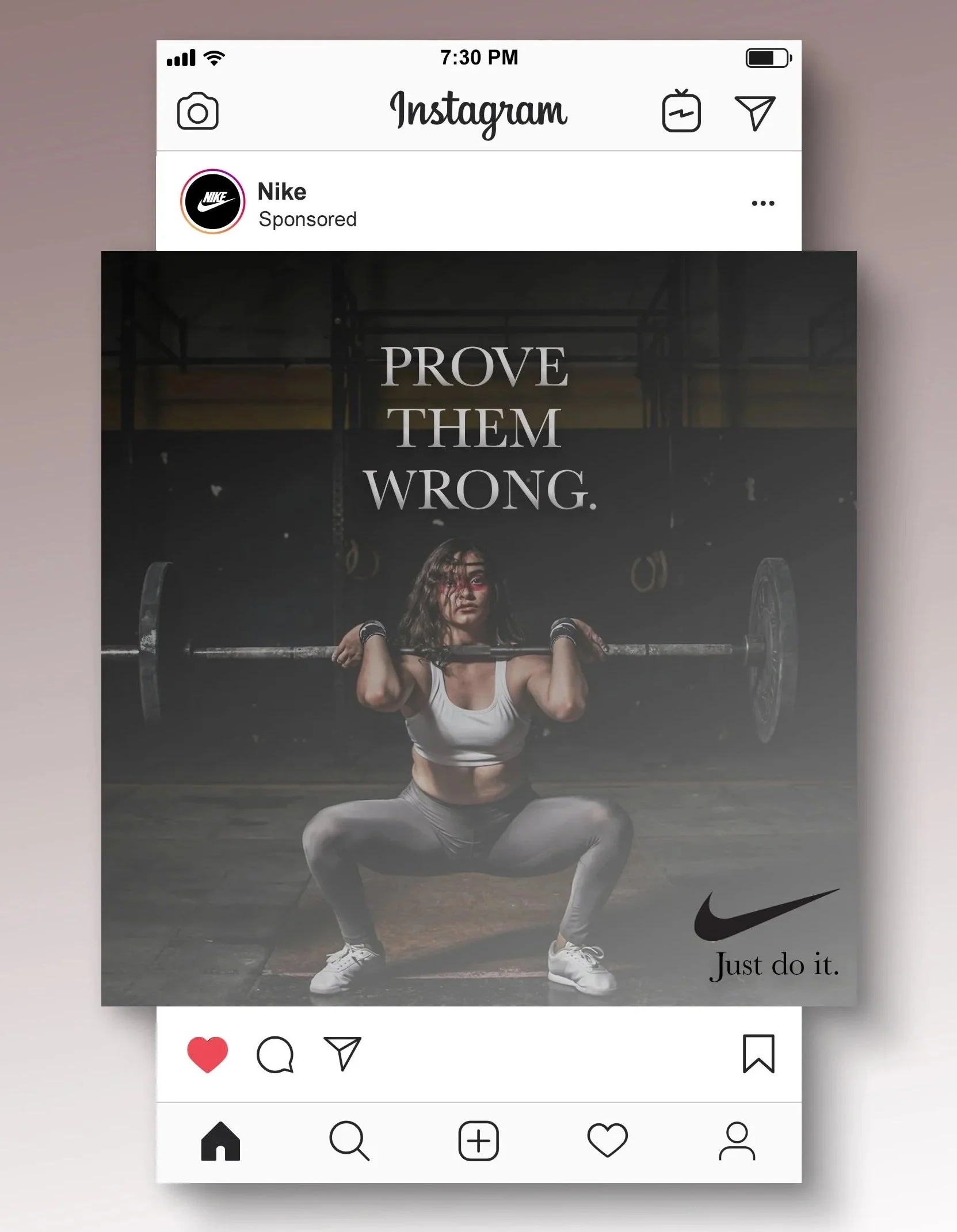
Nike
Nike’s advertising has always stood out to me for its ability to inspire and empower, creating a genuine emotional connection with the brand. Their iconic tagline, “Just Do It,” remains one of the most powerful and recognizable in advertising.
For these social media designs, I leaned into a darker, gradient aesthetic to match the depth and emotion behind each message. I featured women across a range of athletic activities, using both the visuals and headline copy to reflect Nike’s empowering tone. Together, the imagery and messaging reinforce strength, confidence, and momentum.
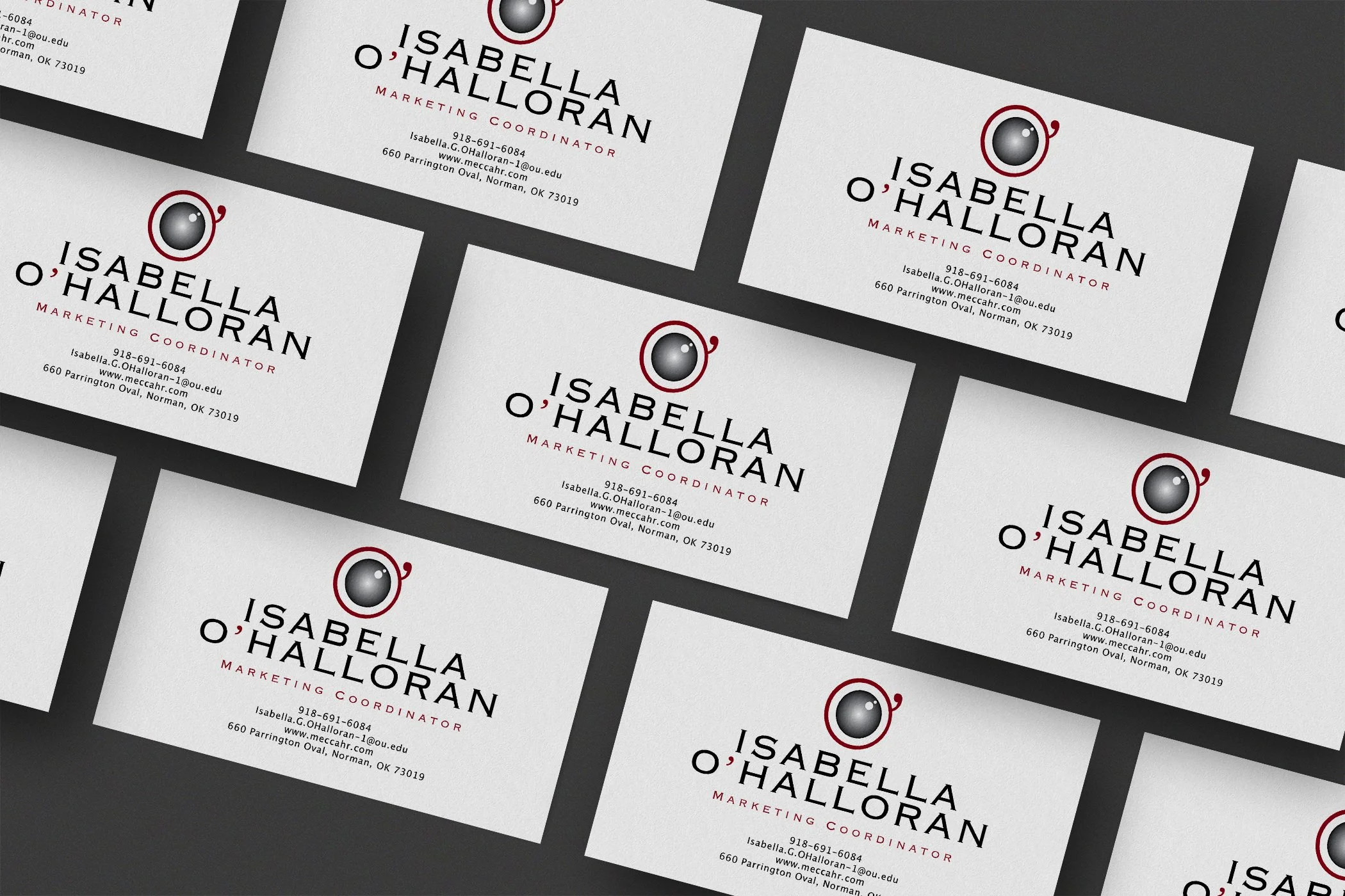
Personal Logo
For my personal logo, I created a camera lens using the “O” from my last name, O’Halloran, and incorporated the apostrophe as a defining detail. The apostrophe is a unique part of my name, and turning it into a design element helps the mark feel distinctive and personal.
The logo uses dark red, black, white, and a dark gray gradient. I chose red because it has always been one of my favorite colors, and the gradient adds depth and dimension to the lens. The logo is flexible and can stand alone as an icon or be integrated as the “O’” in O’Halloran.